---
title: "Approximate Carathéodory: averaging handwritten digits"
subtitle: "Math 123: Mathematical Aspects of Data Analysis — Fall 2026"
date: 2026-09-10
number-sections: false
jupyter: python3
format:
html:
toc: true
toc-depth: 2
code-line-numbers: true
code-tools: true
out-width: "100%"
column: page
execute:
echo: true
---
Here, we'll try to numerically illustrate the [approximate Caratheodory theorem](../../lectures/lecture-02.qmd#thm-approximate-caratheodory) we proved in lecture 2.
## Meet the digits
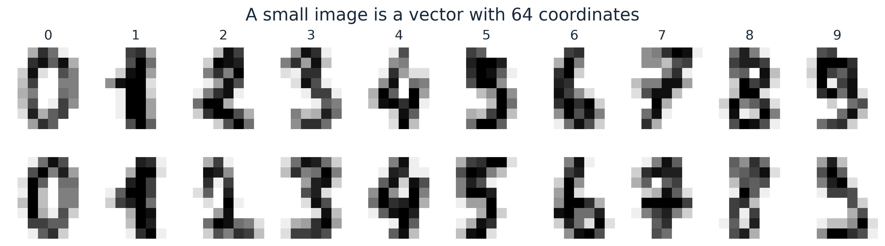
The [scikit-learn digits dataset](https://scikit-learn.org/stable/modules/generated/sklearn.datasets.load_digits.html) contains 1,797 handwritten digits, labeled 0 through 9.
Each image has just $8\times 8$ grayscale pixels, with integer intensities from 0 to 16.
Flattening an image gives a vector in $\mathbb{R}^{64}$; reshaping it lets us see that vector again.
We scale intensities to $[0,1]$ and use the same grayscale limits in every image below, so brightness is comparable across panels.
```{python}
import numpy as np
import matplotlib.pyplot as plt
from matplotlib.ticker import PercentFormatter, ScalarFormatter
from sklearn.datasets import load_digits

digits = load_digits()
images = digits.images / 16.0
X = digits.data[digits.target == 3] / 16.0
n, d = X.shape
mu = X.mean(axis=0)

print(f"Full dataset: {len(images):,} images, each 8 × 8 pixels")
print(f"Digit 3: {n} images represented by vectors in R^{d}")
assert (n, d) == (183, 64)
```
```{python}
#| code-fold: true
#| code-summary: "Figure style and image helper"
plt.rcParams.update({
    "figure.dpi": 150,
    "figure.facecolor": "#ffffff",
    "axes.facecolor": "#ffffff",
    "savefig.facecolor": "#ffffff",
    "font.size": 12,
    "axes.titlesize": 13,
    "axes.labelsize": 12,
    "text.color": "#182c3d",
    "axes.labelcolor": "#182c3d",
    "xtick.color": "#182c3d",
    "ytick.color": "#182c3d",
    "axes.spines.top": False,
    "axes.spines.right": False,
})
BLUE = "#2563a6"
ORANGE = "#b95013"
TEAL = "#087f7b"


def show_digit(ax, vector, title=None):
    artist = ax.imshow(
        np.asarray(vector).reshape(8, 8),
        cmap="gray_r", vmin=0, vmax=1, interpolation="nearest",
    )
    ax.set_xticks([])
    ax.set_yticks([])
    for spine in ax.spines.values():
        spine.set_visible(False)
    if title is not None:
        ax.set_title(title, pad=8)
    return artist
```
```{python}
#| label: fig-digits-tour
#| fig-cap: "Two examples of each digit. Darker pixels have higher intensity; the original 8 × 8 pixels are shown without smoothing."
#| fig-alt: "A two-row gallery showing two handwritten examples of each digit from zero to nine."
#| code-fold: true
#| code-summary: "Plot a tour of the ten digits"
fig, axes = plt.subplots(2, 10, figsize=(12, 3.4), layout="constrained")
for digit in range(10):
    positions = np.flatnonzero(digits.target == digit)[:2]
    for row, position in enumerate(positions):
        show_digit(axes[row, digit], images[position], str(digit) if row == 0 else None)
fig.suptitle("A small image is a vector with 64 coordinates", fontsize=17)
plt.show()
```
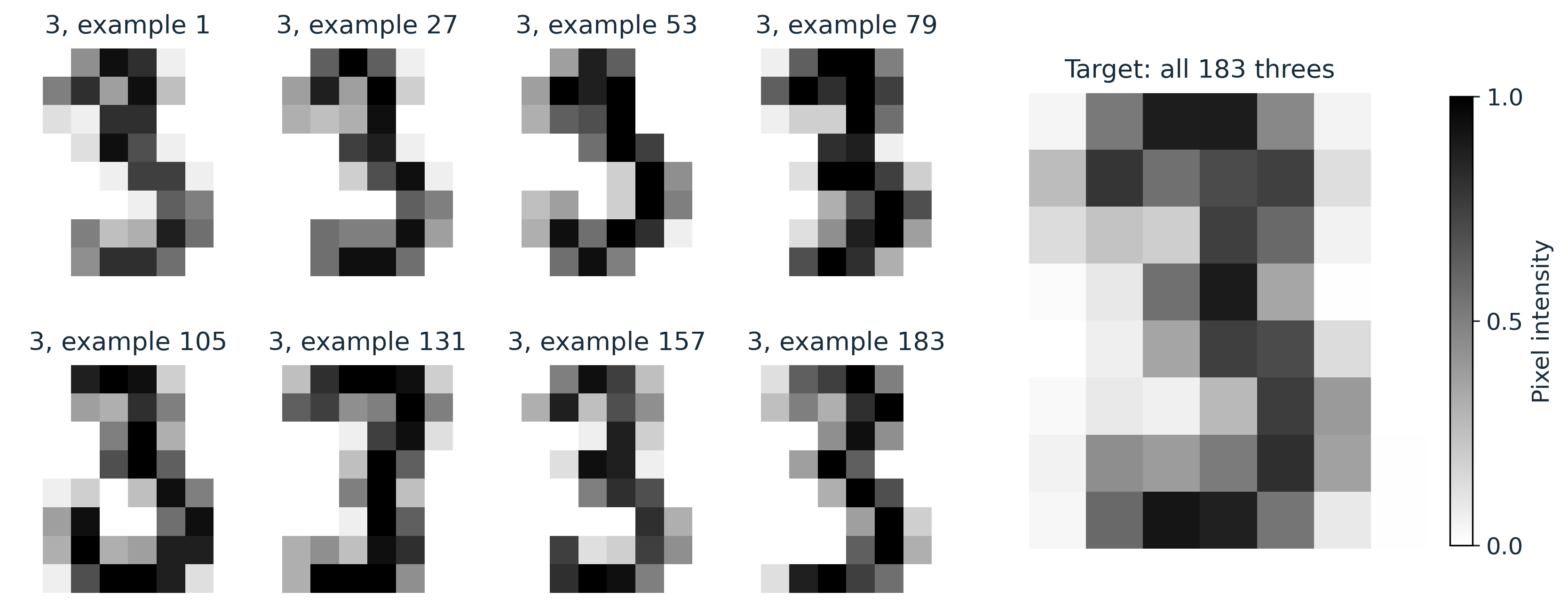
Our **target** is the exact mean of all 183 digit-3 images:
$$
\mu = \frac{1}{183}\sum_{i=1}^{183} x_i.
$$
This is a convex combination!
The weights are nonnegative and sum to one.
The centroid blends different handwriting styles, so it need not look like any particular person's 3.
```{python}
#| label: fig-three-centroid
#| fig-cap: "Eight individual 3s and their target: the centroid of all 183 available 3s."
#| fig-alt: "Eight examples of handwritten threes beside a larger image of the exact centroid."
#| code-fold: true
#| code-summary: "Plot individual 3s beside the target"
fig = plt.figure(figsize=(11, 4.4), layout="constrained")
grid = fig.add_gridspec(2, 6)
for j, index in enumerate(np.linspace(0, n - 1, 8, dtype=int)):
    ax = fig.add_subplot(grid[j // 4, j % 4])
    show_digit(ax, X[index], f"3, example {index + 1}")
target_ax = fig.add_subplot(grid[:, 4:])
artist = show_digit(target_ax, mu, "Target: all 183 threes")
fig.colorbar(artist, ax=target_ax, shrink=0.75, ticks=[0, 0.5, 1], label="Pixel intensity")
plt.show()
```
## A sparse approximation by sampling
Draw $I_1,\ldots,I_k$ independently and uniformly from $\{1,\ldots,183\}$, **with replacement**, and set
$$
\widehat\mu_k = \frac{1}{k}\sum_{j=1}^k x_{I_j}.
$$
This is a **$k$-sparse convex combination**!
At most $k$ of the 183 source images receive nonzero weight.
```{python}
seed = 123
rng = np.random.default_rng(seed)
k_values = np.array([1, 2, 4, 8, 16, 32, 64])
n_trials = 32

samples = {}
approximations = {}
for k in k_values:
    indices = rng.integers(0, n, size=(n_trials, k))
    samples[k] = indices
    approximations[k] = X[indices].mean(axis=1)  # shape: (32, 64)

# Average the 32 approximations for each k.
ensemble_means = np.stack([approximations[k].mean(axis=0) for k in k_values])
```
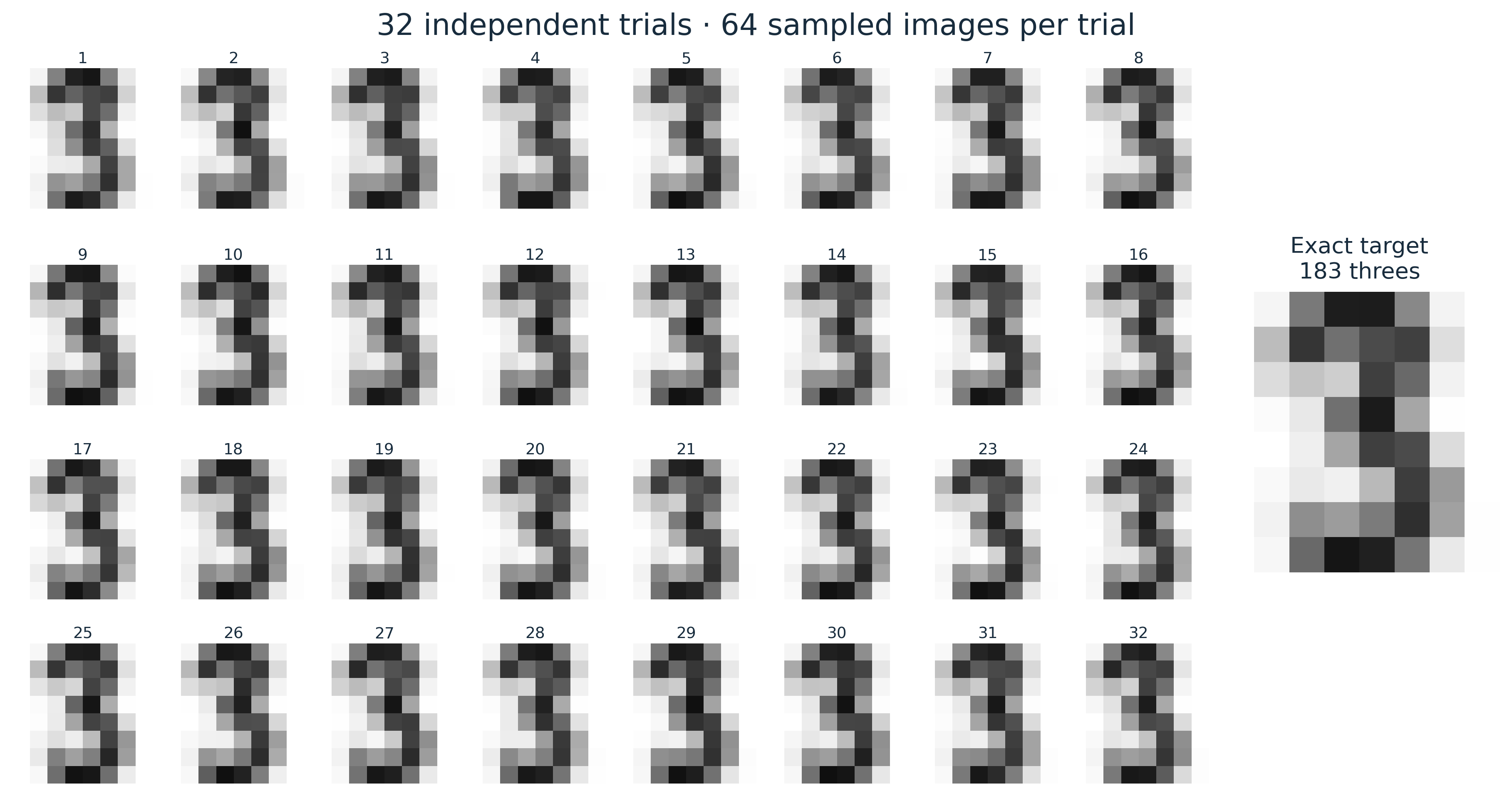
Trials are independent within each $k$, and we draw fresh samples for different $k$ values too.
Thus, an individual trial's error need not decrease at every step.
### Look at all 32 trials
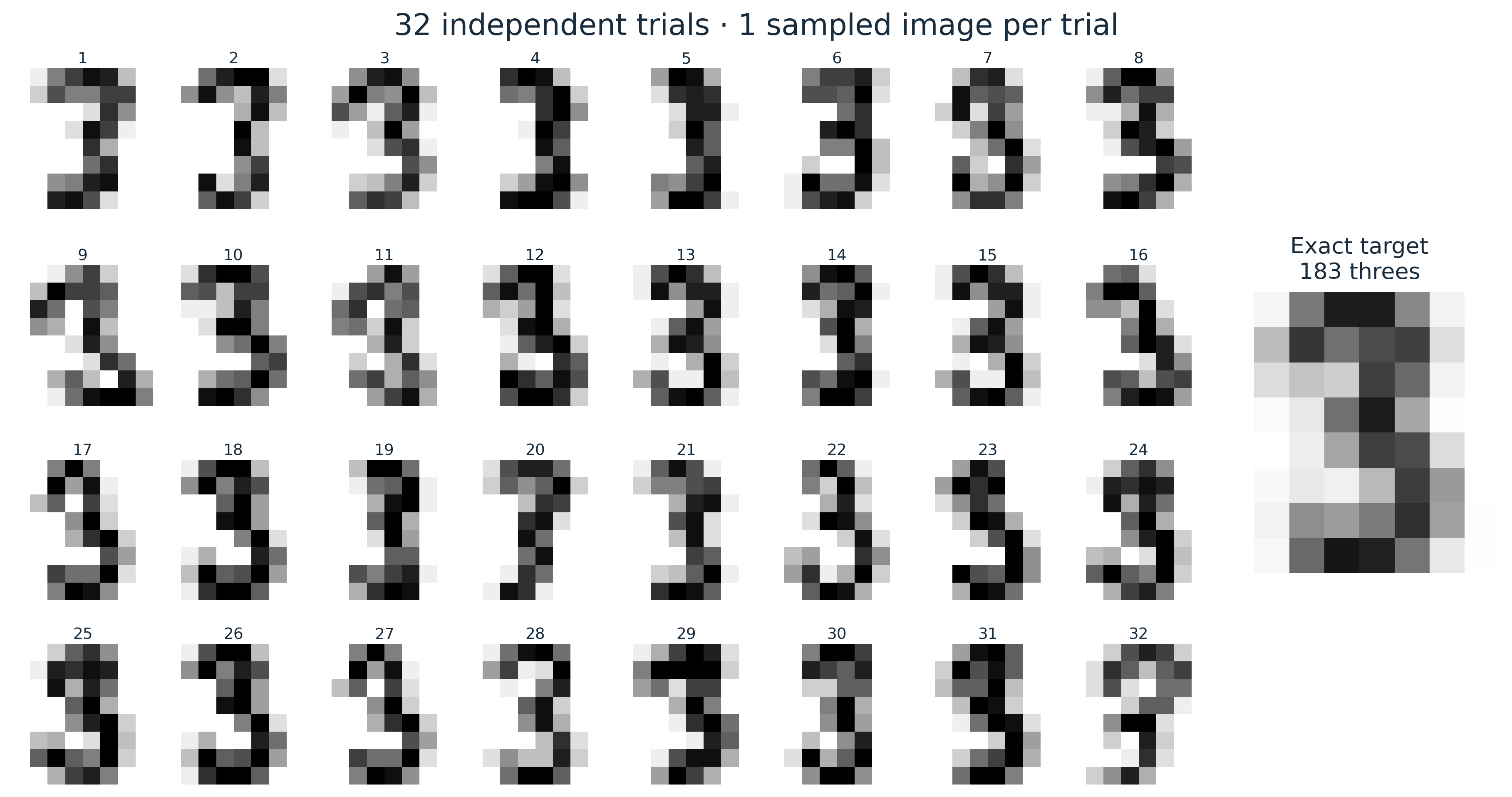
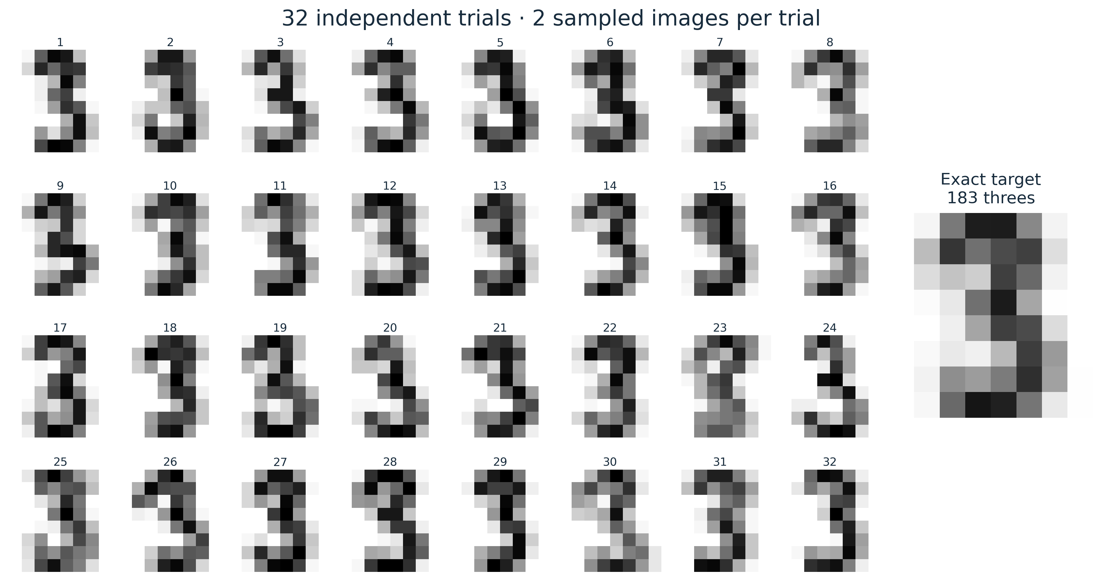
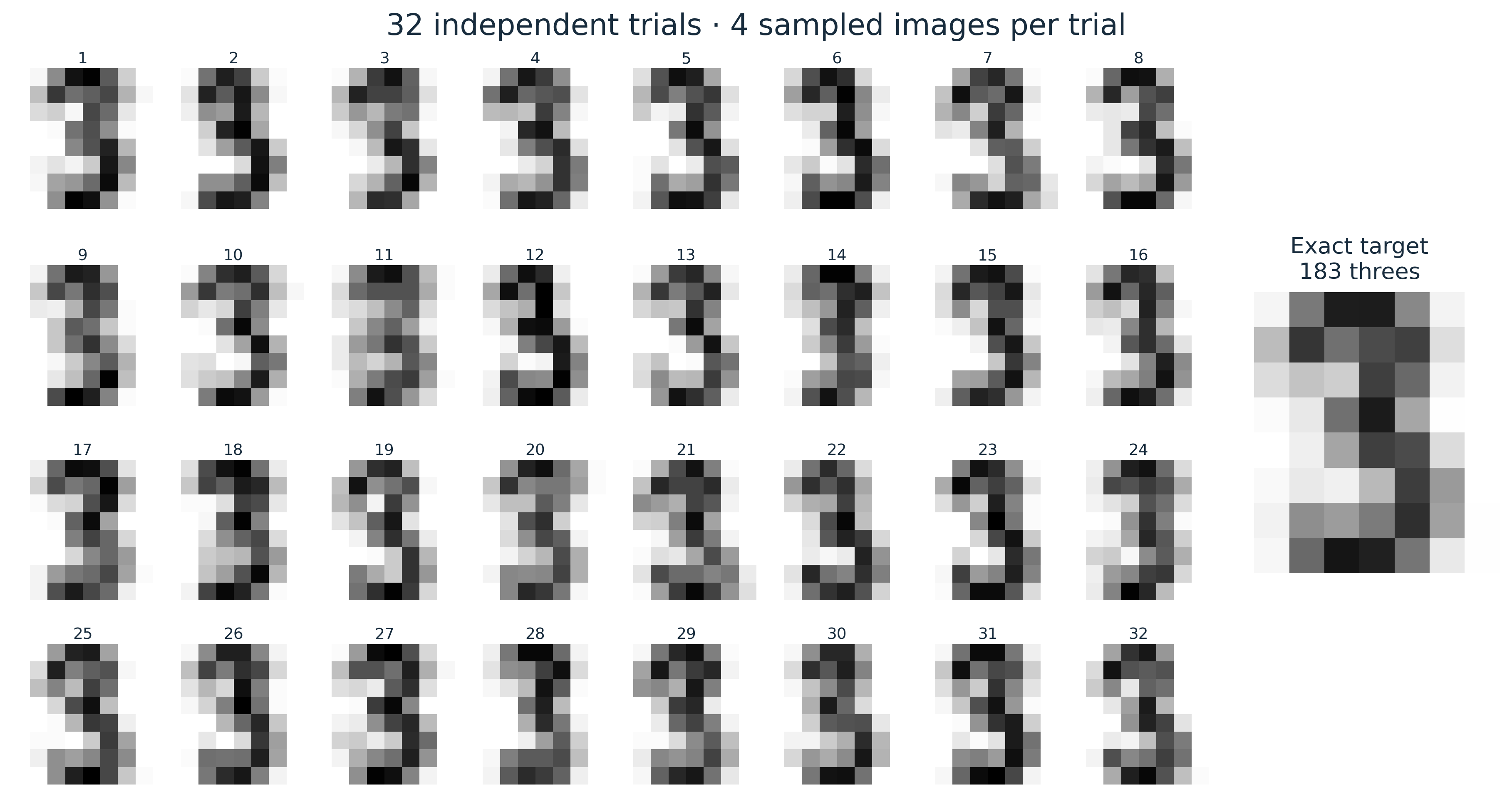
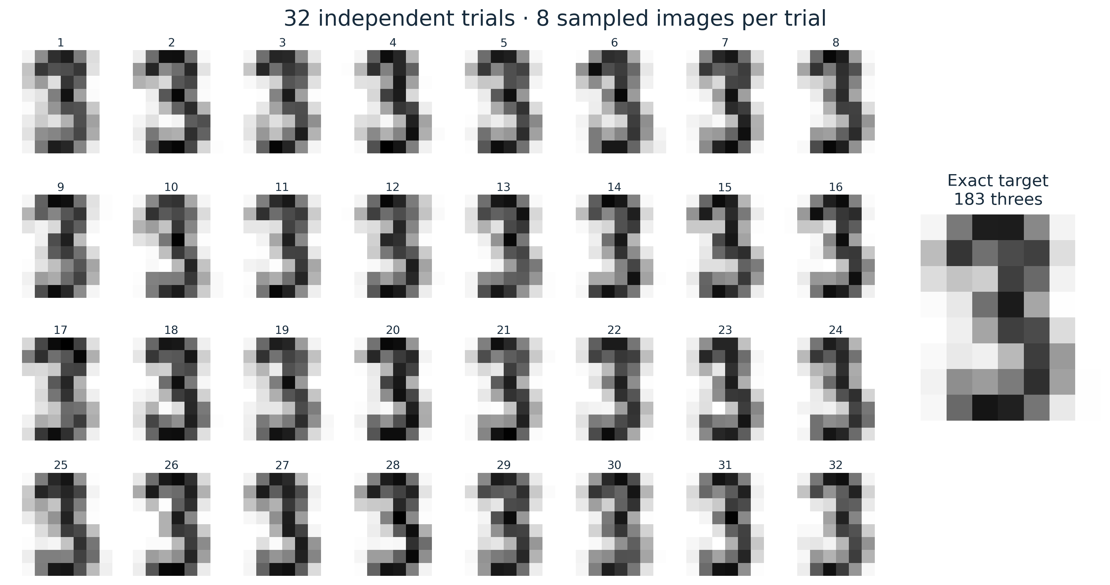
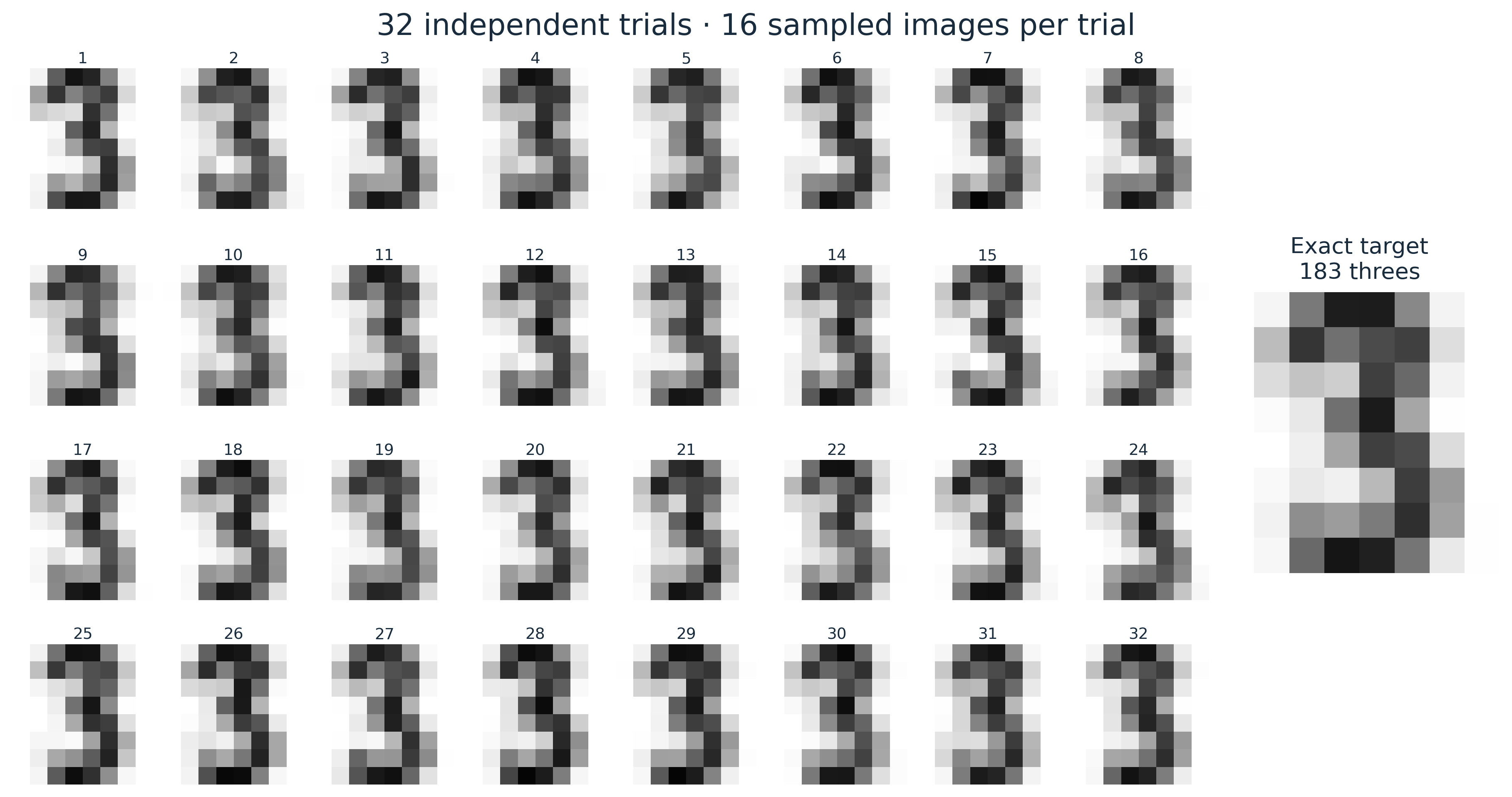
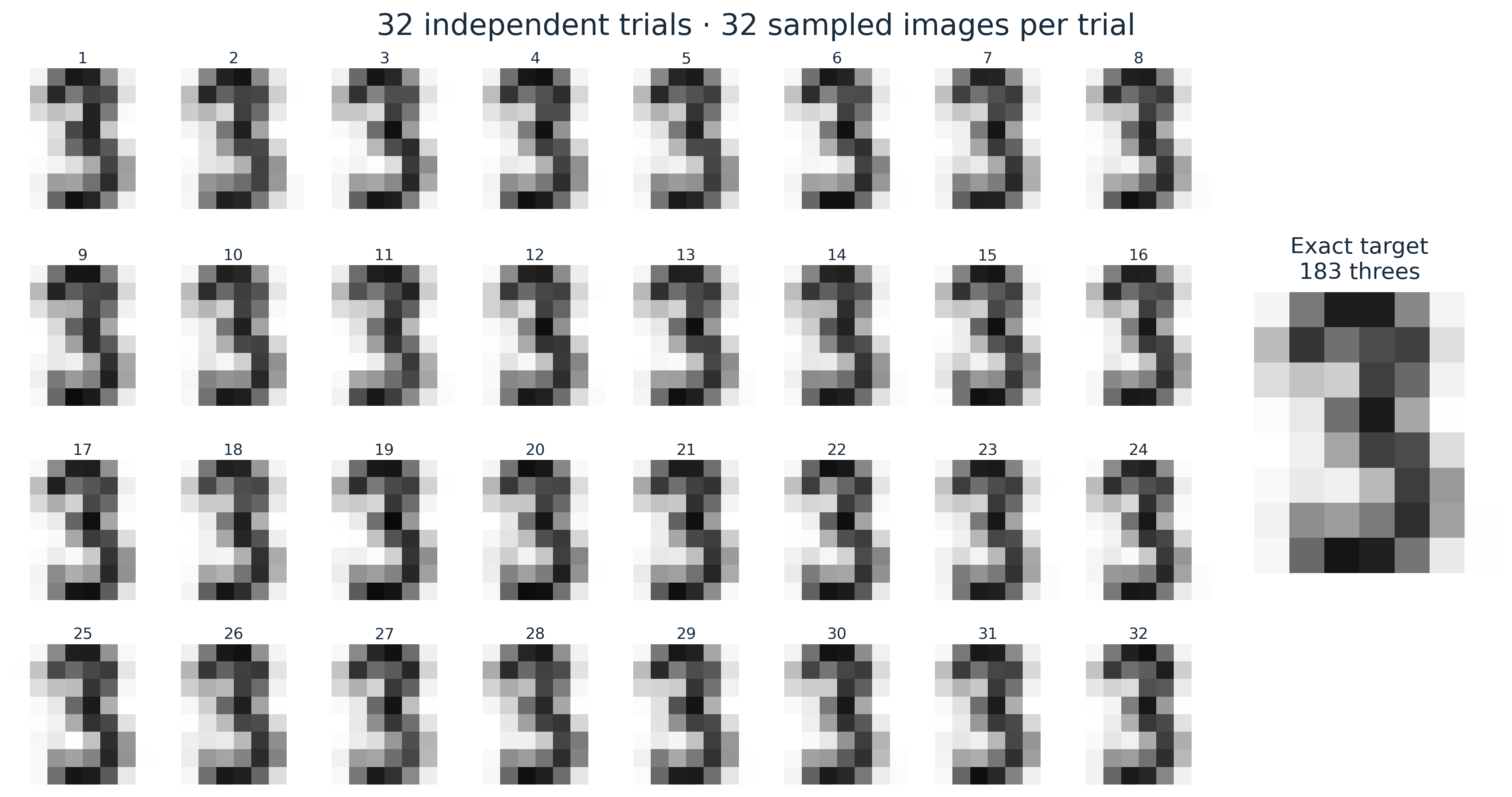
Select a tab to change $k$. Each tile is one $k$-sparse approximation, the average of $k$ sampled images.
For $k=1$ we see individual handwriting styles; as $k$ grows, the images tend to resemble the centroid more closely.
The target appears at the right of every gallery for comparison.
```{python}
#| code-fold: true
#| code-summary: "Define the 32-trial gallery"
def plot_trials(k):
    fig = plt.figure(figsize=(12, 6.4), layout="constrained")
    grid = fig.add_gridspec(4, 10)
    for trial, approximation in enumerate(approximations[k]):
        ax = fig.add_subplot(grid[trial // 8, trial % 8])
        show_digit(ax, approximation)
        ax.set_title(str(trial + 1), fontsize=9, pad=3)
    ax = fig.add_subplot(grid[1:3, 8:])
    show_digit(ax, mu, "Exact target\n183 threes")
    unit = "image" if k == 1 else "images"
    fig.suptitle(f"32 independent trials · {k} sampled {unit} per trial", fontsize=17)
    plt.show()
```
::: {.panel-tabset}
#### k = 1
```{python}
#| code-fold: true
#| code-summary: "Show the k = 1 trials"
plot_trials(1)
```
#### k = 2
```{python}
#| code-fold: true
#| code-summary: "Show the k = 2 trials"
plot_trials(2)
```
#### k = 4
```{python}
#| code-fold: true
#| code-summary: "Show the k = 4 trials"
plot_trials(4)
```
#### k = 8
```{python}
#| code-fold: true
#| code-summary: "Show the k = 8 trials"
plot_trials(8)
```
#### k = 16
```{python}
#| code-fold: true
#| code-summary: "Show the k = 16 trials"
plot_trials(16)
```
#### k = 32
```{python}
#| code-fold: true
#| code-summary: "Show the k = 32 trials"
plot_trials(32)
```
#### k = 64
```{python}
#| code-fold: true
#| code-summary: "Show the k = 64 trials"
plot_trials(64)
```
:::
### Average the 32 approximations
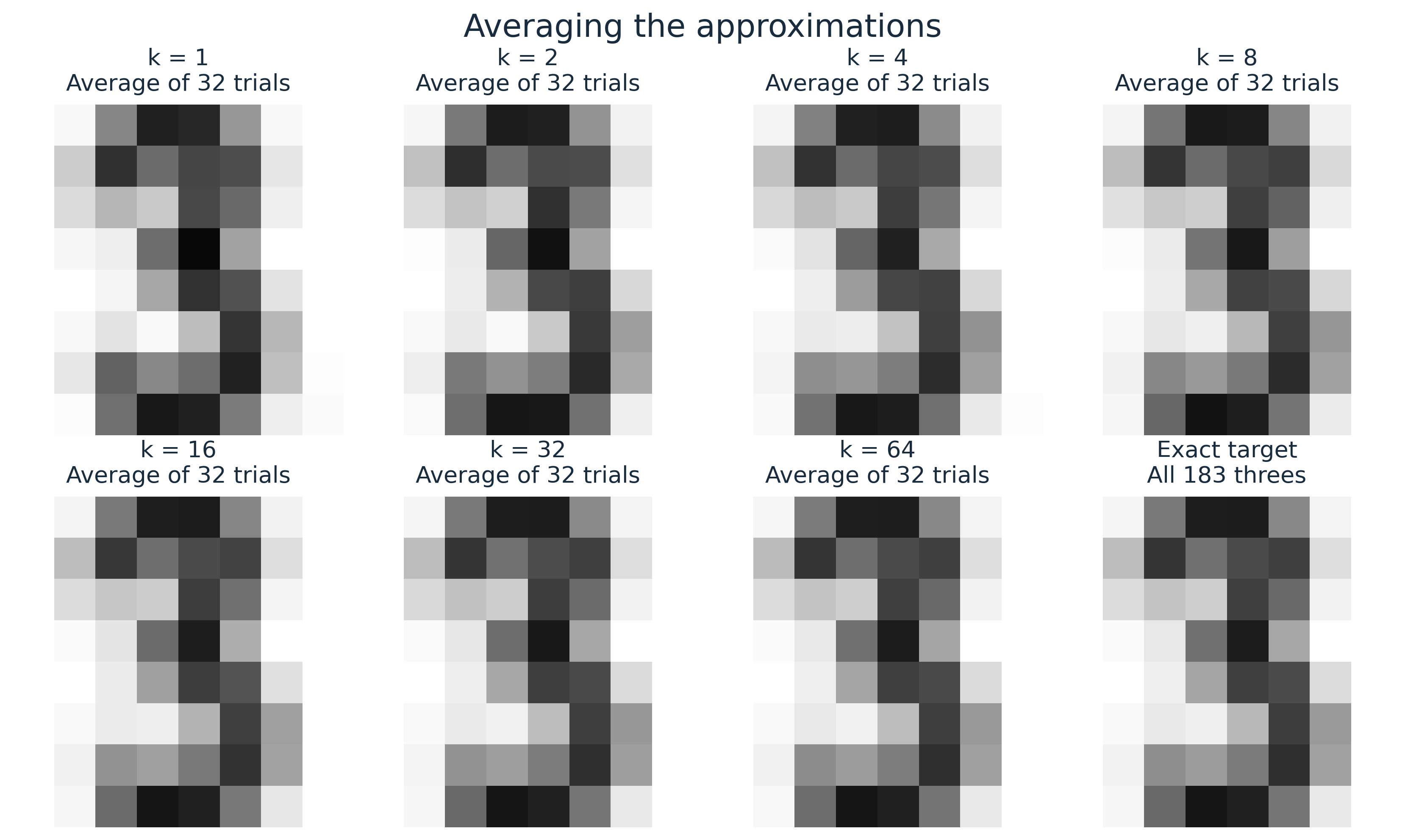
For each $k$, the next gallery shows the average of all 32 trials,
$\overline\mu_k = \frac{1}{32}\sum_{r=1}^{32}\widehat\mu_k^{(r)}$.
::: {.callout-note}
## Two different averages
Each **individual trial** uses $k$ sampled images and has support at most $k$.
The **average of 32 trials** uses $32k$ draws and can have support as large as $\min(32k,183)$.
It is usually more accurate, but is not generally $k$-sparse.
We keep these two objects separate when measuring error.
:::
```{python}
#| label: fig-ensemble-means
#| fig-cap: "The average of 32 independent k-sparse approximations at each k, with the exact centroid at bottom right. All panels share the same intensity scale."
#| fig-alt: "Seven averaged approximations for k from one to 64 and the exact target, in a two-by-four gallery."
#| code-fold: true
#| code-summary: "Plot the average of the 32 trials at each k"
fig, axes = plt.subplots(2, 4, figsize=(11, 6.5), layout="constrained")
for ax, k, average in zip(axes.flat, k_values, ensemble_means):
    show_digit(ax, average, f"k = {k}\nAverage of 32 trials")
show_digit(axes.flat[-1], mu, "Exact target\nAll 183 threes")
fig.suptitle("Averaging the approximations", fontsize=18)
plt.show()
```
### Measure error against the exact mean
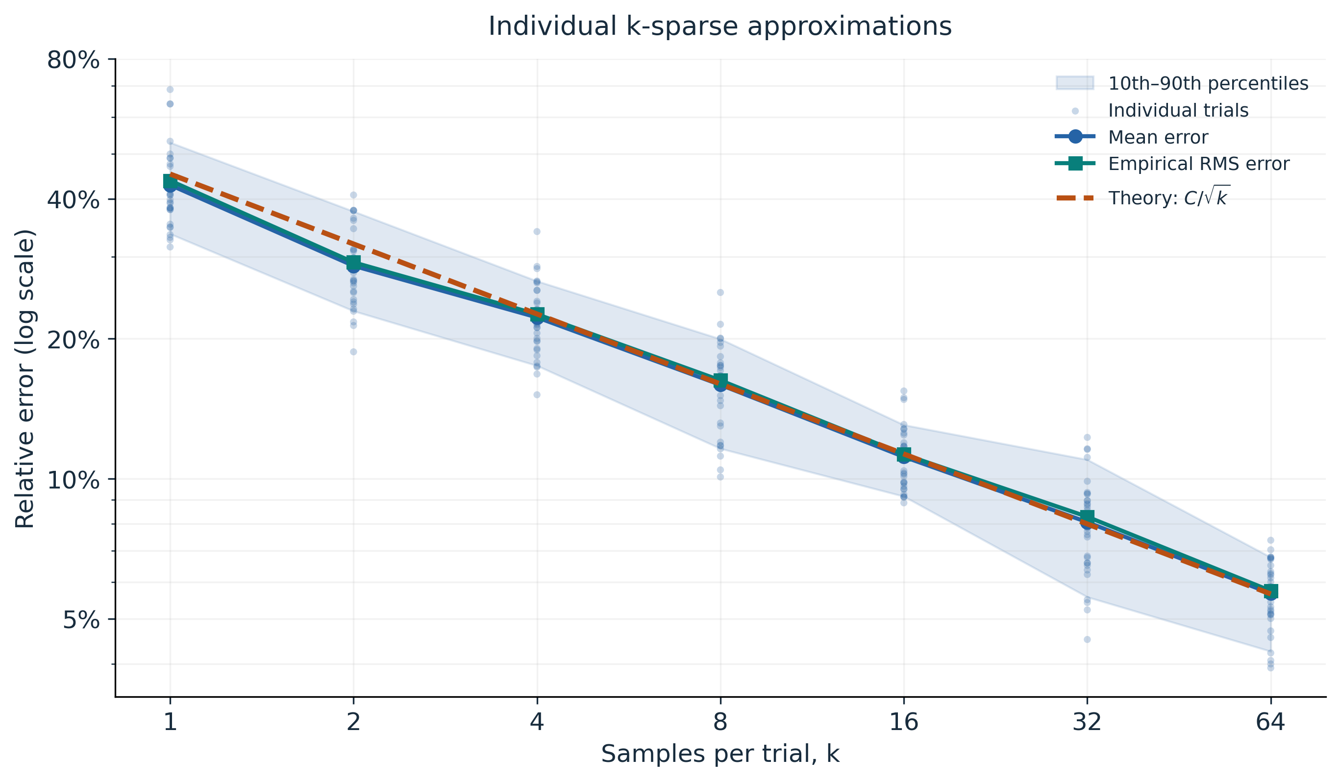
We report relative Euclidean error $\|\widehat\mu_k-\mu\|_2/\|\mu\|_2$.
This equals relative Frobenius error for the reshaped $8\times8$ images.
```{python}
mu_norm = np.linalg.norm(mu)
sigma_squared = np.mean(np.sum((X - mu) ** 2, axis=1))
C = np.sqrt(sigma_squared) / mu_norm

# Rows correspond to k; columns correspond to the 32 independent trials.
errors = np.stack([
    np.linalg.norm(approximations[k] - mu, axis=1) / mu_norm
    for k in k_values
])
mean_error = errors.mean(axis=1)
rms_error = np.sqrt((errors ** 2).mean(axis=1))
q10, q90 = np.quantile(errors, [0.10, 0.90], axis=1)
predicted_rms = C / np.sqrt(k_values)

print(f"Theoretical relative RMS error: {C:.3f} / sqrt(k)")
```
```{python}
#| label: fig-error-decay
#| fig-cap: "Error statistics from 32 individual trials at each k. The shaded band is the empirical 10th–90th percentile range, not a confidence interval."
#| fig-alt: "A log-log plot of individual trial errors, mean error, and empirical RMS error compared with the theoretical k to the minus one-half decay."
#| code-fold: true
#| code-summary: "Plot error statistics and the theoretical decay curve"
fig, ax = plt.subplots(figsize=(9, 5.2), layout="constrained")
ax.fill_between(k_values, q10, q90, color=BLUE, alpha=0.14, label="10th–90th percentiles")
ax.scatter(
    np.repeat(k_values, n_trials), errors.ravel(),
    s=12, color=BLUE, alpha=0.25, edgecolors="none", label="Individual trials",
)
ax.plot(k_values, mean_error, "o-", color=BLUE, linewidth=2, label="Mean error")
ax.plot(k_values, rms_error, "s-", color=TEAL, linewidth=2, label="Empirical RMS error")
ax.plot(k_values, predicted_rms, "--", color=ORANGE, linewidth=2.5, label=r"Theory: $C/\sqrt{k}$")
ax.set_title("Individual k-sparse approximations", pad=12)

ax.set_xscale("log", base=2)
ax.set_yscale("log")
ax.set_xticks(k_values)
ax.xaxis.set_major_formatter(ScalarFormatter())
ax.yaxis.set_major_formatter(PercentFormatter(xmax=1))
ax.set_xlabel("Samples per trial, k")
ax.set_ylabel("Relative error (log scale)")
ax.grid(True, which="both", alpha=0.16)
ax.legend(fontsize=9, frameon=False, loc="best")
ax.set_yticks([0.05, 0.1, 0.2, 0.4, 0.8])
plt.show()
```